
MADE Seasonal
Deliverables: Print, Digital, Branding
Client:
ISS Food Services
My role:
Creative direction
Art direction
Illustration
Motion design
Description:
ISS is one of the world’s leading workplace experience and facilities management companies, with catering as one of their core services. To stay ahead of the competition, they needed to respond to growing client demand for sustainability, provenance, and environmental responsibility. I was tasked with designing and branding a new line of menus that reflected these values and brought the concept to life.

Design Approach
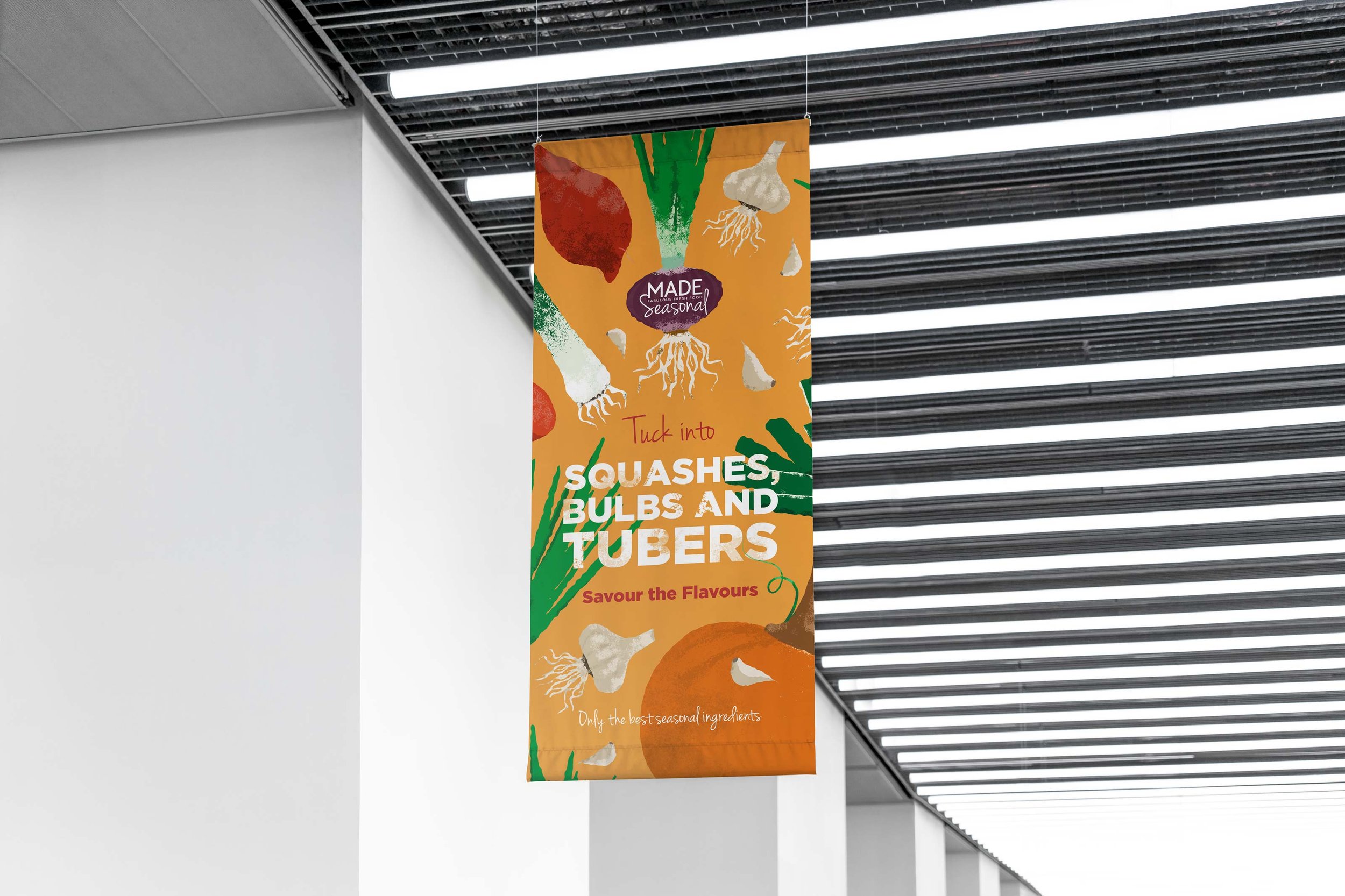
With sustainability and provenance at the heart of the brief, a hand-drawn illustration style felt like the perfect fit—evoking authenticity while keeping the visuals fresh and modern. Rich textures and vibrant colours run throughout the design, creating a warm, familiar feel with contemporary appeal.
We started by developing a dedicated sub-brand lockup to clearly distinguish this new line within the wider ISS brand.

Deliverables
We were tasked with delivering a range of assets for rollout across multiple locations. All materials had to adhere to strict production guidelines, accommodate existing display fixtures, and align with ISS’s established rollout procedures
-
A concise guide outlining the sub-brand’s visual elements, ensuring consistency across all applications.
-
Posters and flyers designed for high-visibility placement and easy distribution across various locations.
-
Custom-designed menus showcasing the new offering, aligned with the sub-brand’s visual identity.
-
Engaging motion graphics designed for in-venue screens to promote the new menu line.
-
Sustainable packaging designs for to-go items, including sleeves and wrappers that reflected the brand’s environmental focus.
-
Additional materials tailored to specific location needs, including table talkers, shelf strips, and wayfinding graphics.


Process & Collaboration
I collaborated closely with ISS’s marketing team, who acted as a bridge between senior leadership, chefs, and location managers. Together, we distilled diverse feedback into clear priorities and developed creative solutions that met everyone’s needs. This ensured the final design was both impactful and practical across a wide range of applications.


Limitations
While the project allowed room for creative exploration, it also came with clear boundaries. Certain elements—such as the existing “Made: Fabulous food made fresh” logo and a predefined font set—were fixed parts of the overarching ISS brand guidelines. Navigating these constraints required a careful balance: evolving the identity in meaningful ways without breaking alignment with the parent brand.


Outcome and impact
The new sub-brand was successfully rolled out across ISS locations, receiving positive feedback from both internal stakeholders and end users. The visual identity struck the right balance between warmth and credibility, helping ISS communicate their commitment to sustainability in a clear and engaging way. Built as a versatile identity system, it gave ISS the flexibility to tailor assets to different sites and seamlessly adapt to seasonal updates or menu changes—ensuring long-term scalability and brand consistency.
